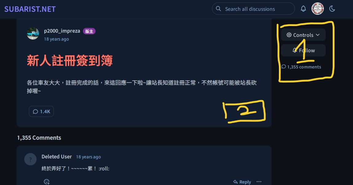
By default, the comment section is set to "autoload," which makes it difficult for users to easily find the entrance to the comment section located at the bottom when there are many comments on an article. Although clicking "last page" can navigate to it, the operation is not intuitive.

The anticipated positions maybe 1 or 2, but I believe position 1 is still more reasonable, especially when the main text of the topic is longer or when suddenly wanting to reply to the topic while viewing the comments.
Maybe add it in the "Controls" item, so that the phone screen can also be operated reasonably

